Use chart analysis to understand bubbles
 0 Comments


 Do we need to worry about a bubble, or is the market activity just the normal excitement in the market? After the collapse in Dubai, many people are asking this question. Some analysts are warning of a bubble in several of the world markets. A market bubble is defined in several ways, but we prefer to use chart analysis to decide if a bubble is developing.
The bubble conditions are clearly revealed on a chart of price activity. The price activity is a reflection of human behavior in the market. The way that price behaves on a price chart leads to two measures or indications of the emotional behavior of the market. These give us a warning of when a bubble is being created. They also show the difference between the normal enthusiasm and excitement of the crowd and an excess of excitement, which leads to a bubble.
Chart analysis is used to understand the behavior of people in the market. Technical analysis is used to understand the behavior of the two most powerful groups of the market. When people act in small groups their behavior is different from when they act in large groups.
The behavior of the market is a reflection of the behavior of people. When people join crowds they behave differently so we use different analysis methods to analyze this behavior.
We use technical analysis to follow the behavior of large groups in the markets. The large groups are not bulls and bears. This only describes the way we feel about the market. The largest groups are traders and investors. Traders look for short-term opportunity. Investors look for longer term sustainable trends. Investor activity is necessary to support the continuation of any up trend.
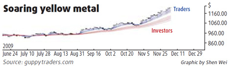
We prefer to use a Guppy Multiple Moving Average (GMMA) indicator to understand the behavior of traders and investors. The long-term group of averages shows the behavior of investors. When this group is well separated it shows the trend is well supported. The lower edge of the long-term average groups shows where the support level is located.
The short-term group of averages shows the behavior of traders. When this group is well separated it shows a high level of trading activity.
The key feature that indicates a bubble is when the separation between the short-term group of averages and the long-term group of averages increases. We can see this very clearly on the Gold price chart. The degree of separation between the two groups of averages is increasing. This shows a strong uptrend that is developing a bubble.
This separation creates a situation where the price can fall from near 1,220 to near 1,080 which is the support level at the lower edge of the long term GMMA. This is a large fall. When the price falls this distance it is difficult to stop the fall, and the result is often a continuation of the market fall. This is a bubble collapse.
The group of people interested in an individual stock is smaller than all the people who are interested in the market. Chart analysis is suitable for understanding this behavior. With an individual stock there are several common chart patterns, which show the behavior of these small groups. These chart patterns include up sloping triangle patterns, flag patterns, typhoon flag patterns and cup chart patterns. The names of the patterns are a convenient way to describe the shape of the price activity. These patterns appear when people become increasingly excited about the future of an individual stock.
Traders who recognize these patterns can identify high probability trading situations. They buy because they know there is a higher probability the price activity will behave in the same way as it has in the past when the same price pattern occurred.
The gold chart shows the market conditions that developed in a bubble. The chart shows the behavior of the two main groups in the market. When we see bubble conditions developing then it is a signal to apply different analysis methods to identify the time when the bubble begins to collapse. This allows traders and investors to collect profits. It is difficult to anticipate the exact situation, which will cause the bubble collapse. Good chart analysis shows when a bubble is developing so investors can be prepared to act quickly.
The author is an international financial technical analysis expert, an equity and derivatives trader and author of many books on trading techniques. He appears regularly on CNBCAsia and is known as "The Chart Man".


Comments